iStock · Getty Images

Video Acceleration

iStock is a stock content platform offering a vast library of images, illustrations, and video footage. Despite its broad content offering, iStock had long been positioned as an image-first provider, leaving its video library largely undiscovered. As one of two product designers on the Video Acceleration team, we partnered closely with a UX writer to propose bold, new design directions that better positioned iStock's video content and met evolving market demands.

Visit iStock
RoleLead Product Designer
TimelineAug 2020
TeamProduct Designers, Product Manager, Product Owner, UX Research, UX Writer
ToolsFigma · Miro · Adobe CC
iStock homepage A/B/C test variants showing video-forward homepage redesign
100% rollout
Winning variant shipped to all users, establishing iStock's first video-first homepage
6 months later
This positioning shift directly preceded iStock's video subscription launch
Challenge

Despite a growing demand for video content, the platform was primarily perceived as an image-only site. This lack of awareness created a significant barrier for both new and existing customers who were unaware of our video library, products, and editing tools. Without clear visibility and integration of video offerings throughout the site experience, we were failing to capture the video-first market and losing users who sought more comprehensive creative assets.

Opportunity

iStock already had a large video library. The opportunity was to get people to notice it, turning an image-centric site into a video-forward experience. The goal was:

  • Make video visible to both new and existing customers
  • Reposition video as a core part of iStock at every touchpoint and keep the brand consistent
  • Protect the image-first experience that most customers came for
What I Did

I was one of two product designers, working with a PM, product owner, UX research, and a UX writer. The project was framed as vision work, so we had room to think boldly before narrowing down.
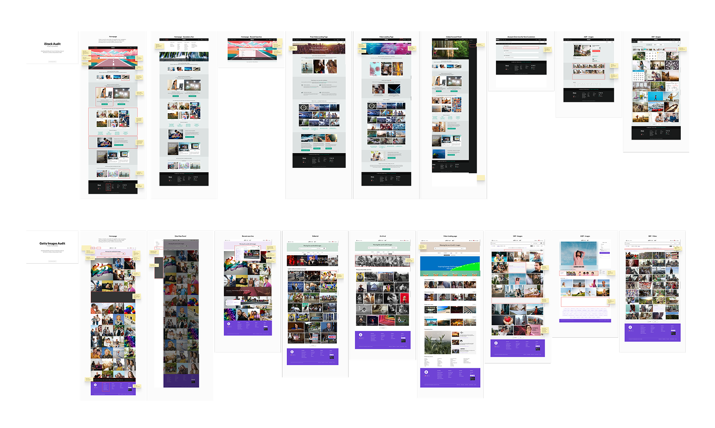
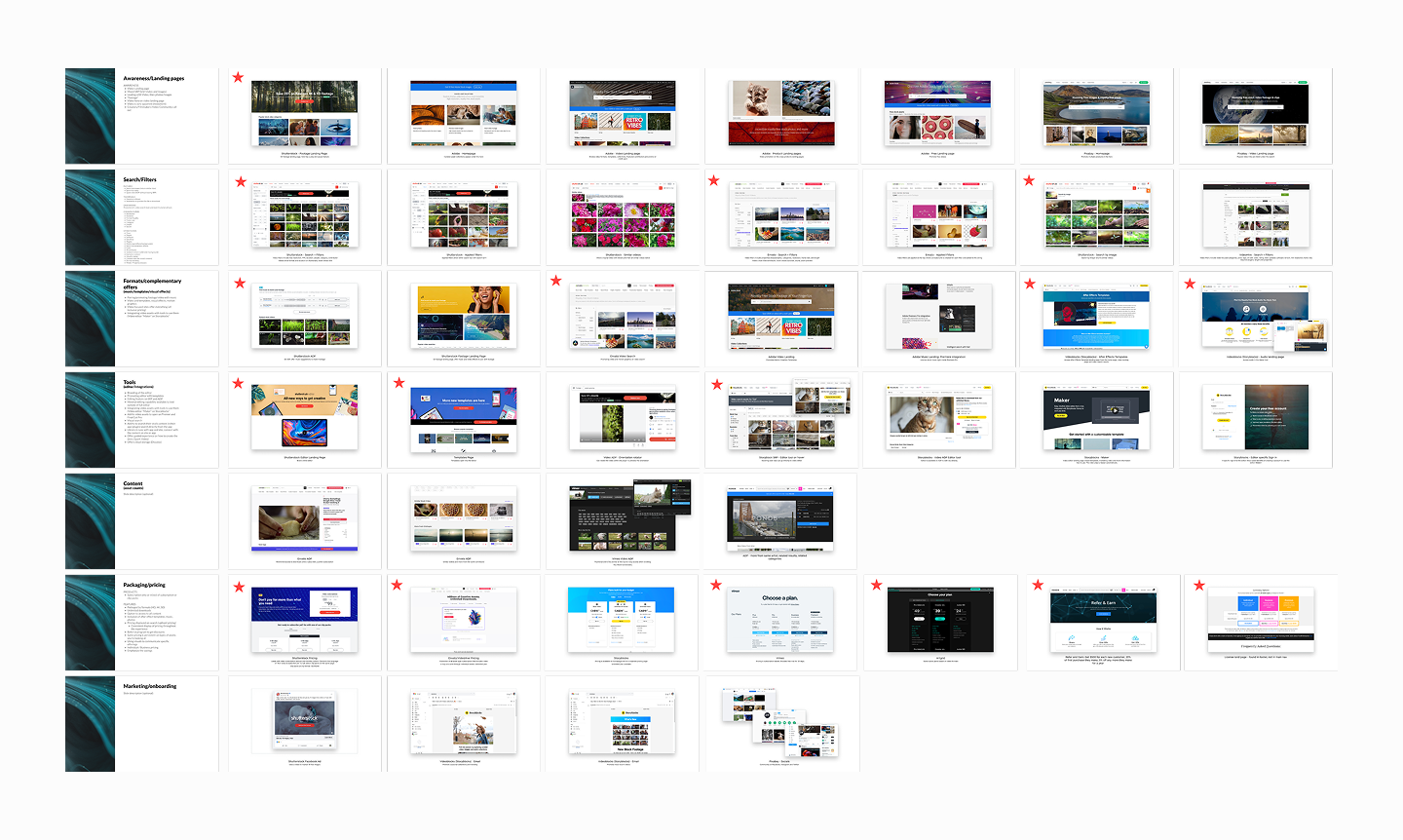
  • Mapping the video experience. I audited every key page on the site to find where video customers hit friction and which pages had the most potential. We paired this with a competitive analysis of Shutterstock, Adobe Stock, Stocksy, Pexels, and others.
  • Facilitating ideation. I ran a workshop on Ideazboard with the broader design team to generate a wide range of directions, including some we knew were too radical to ship.
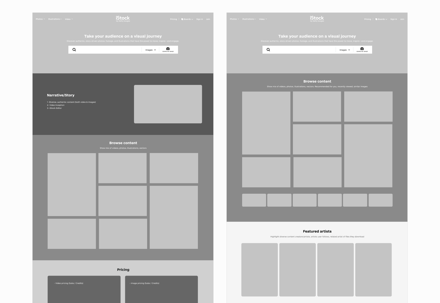
  • Exploring from bold to focused. With the other designer, I started with extreme video-first homepage concepts, then reworked the page hierarchy through wireframes and extended the work to the search results and asset detail pages. When technical constraints surfaced, we narrowed the scope to the homepage.
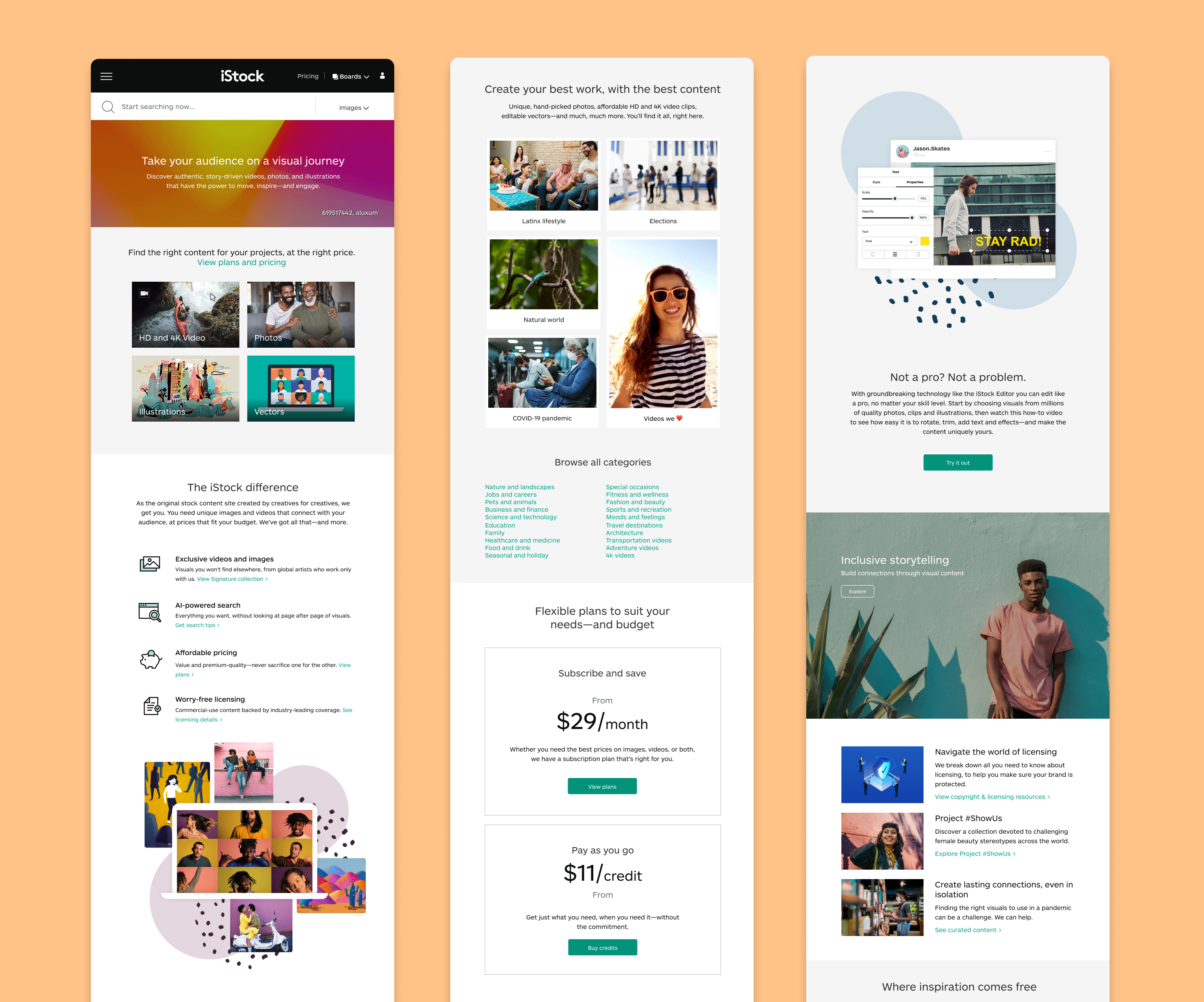
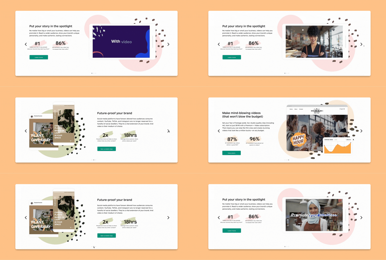
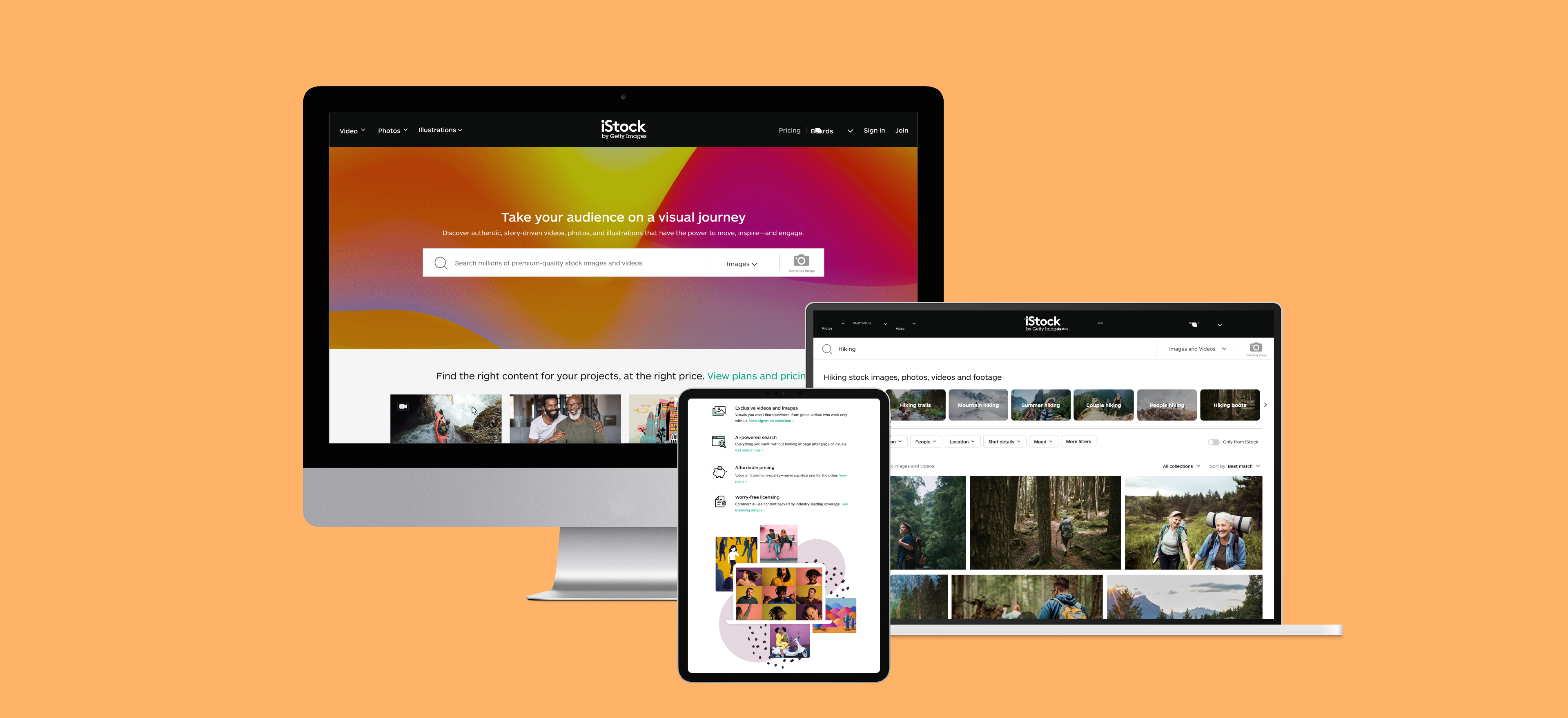
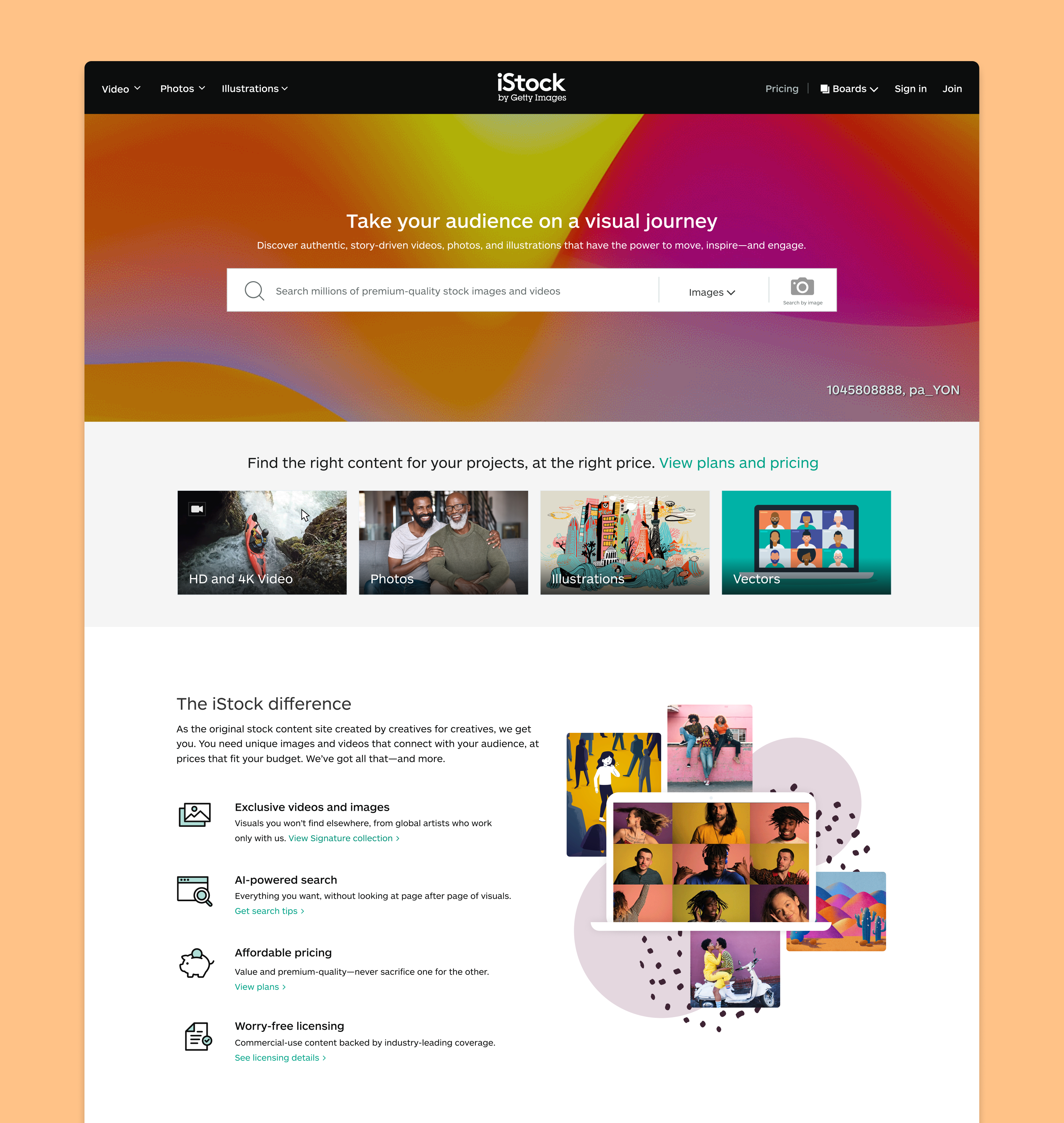
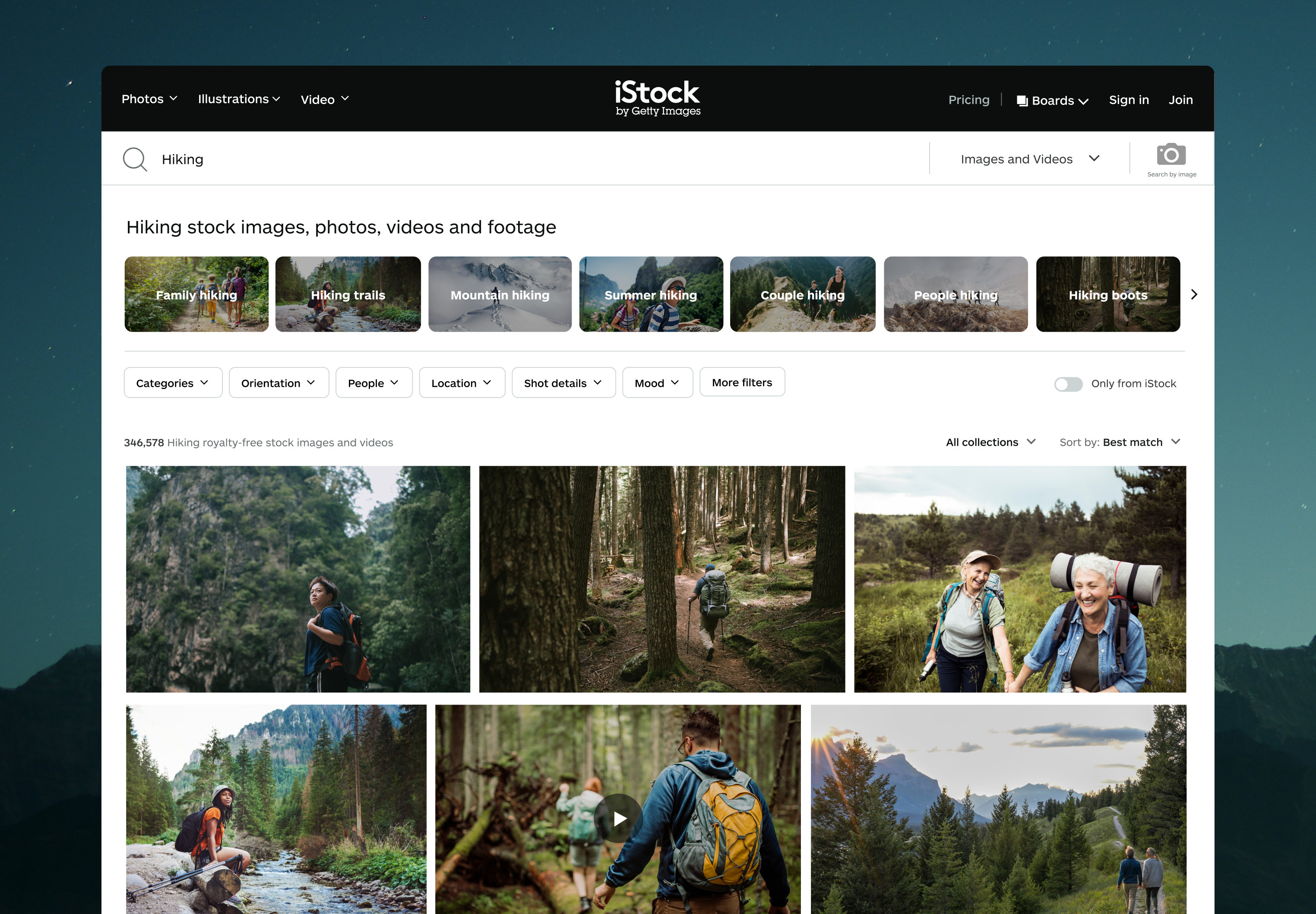
  • Designing video into the homepage. We designed new video elements, content that built awareness of the video library and its benefits, and sections that surfaced iStock's video offerings. We also introduced search results that mixed video and images, and worked with marketing to update the branding elements introduced in the redesign.
  • Designing an A/B/C test. We tested three versions of the hero to see whether autoplay video was worth the page load cost. The video hero won, and the new homepage shipped to 100% of users.
Audit of key iStock and Getty Images pages with sticky-note callouts marking friction points and opportunities for video
Competitive analysis of video-first stock sites
Wireframes exploring a reworked homepage hierarchy with video given more prominence
Outcome

The winning variant shipped to 100% of users, giving iStock its first video-first homepage. It showed that making video more prominent could increase video discovery without disrupting the image-first majority:

  • More video discovery. Video searches and asset views both rose, with little impact on downstream conversion.
  • More pricing page visits. Returning visitors who came for video content converted to orders at higher rates.
  • No harm to bounce or search rates. The image-first majority wasn't disrupted, which gave stakeholders the confidence to keep iterating.

Six months later, iStock launched Premium + Video, its first video subscription, built on the foundation this redesign set.
Key Learnings
  • Involve engineering in vision work early. Some key elements missed the MVP because of technical constraints discovered too late. One early session to pressure-test ideas would have saved mid-project scope changes.
  • Iterate during research, not just before and after. Swapping the prototype video between sessions gave us cleaner signal and validated the fix in real time.
iStock homepage redesign showing video-forward hero with bold headline, category navigation, and featured content grid
iStock video and image search results page for 'Hiking' showing mixed photo and video results with video play indicators in a masonry grid
The video-forward redesign for tablet and mobile view
Animated value prop for homepage

For a closer look at this project or my full process behind it

Contact me